


Current version: v3.0.7 (04/02/2026)
BetterDiscord download
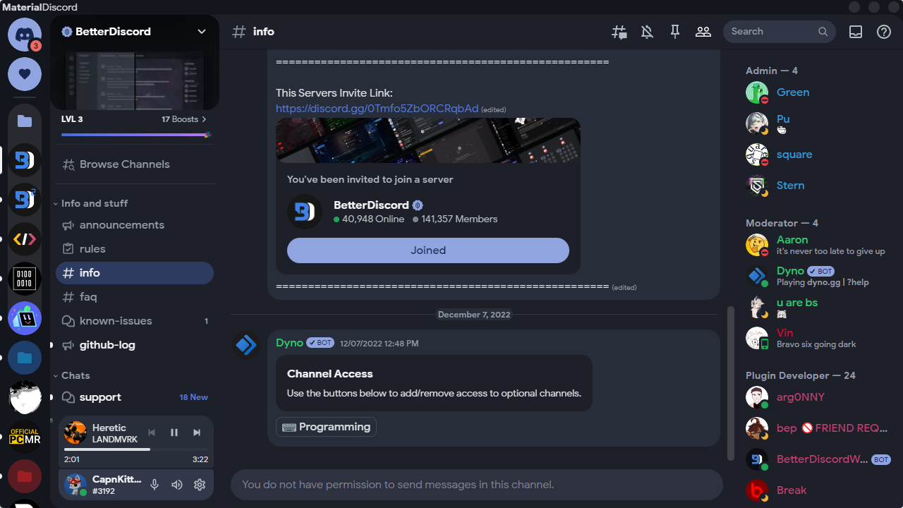
Material Discord Customization plugin
View add-on themes
View source files
Vencord link
https://capnkitten.github.io/BetterDiscord/Themes/Material-Discord/css/source.css
(Previews are subject to be out of date)
** Indicates that it has two values for both the dark and light themes of Discord. Instead of using :root, use .theme-dark or .theme-light.
-
--saturation-modifier- The value that controls the saturation for the entire ui, including buttons. Default:0.31-0.74** -
--lightness-modifier- The value that controls the lightness for the entire ui, including buttons. Default:0.225-2.125** -
--text-lightness-modifier- The value that controls the text lightness. Default:1.0-1.0** -
--ui-darkness-modifier- The value that controls the darkness for the entire ui, excluding buttons and is ONLY for the dark theme. Default:1.0**
-
--app-font- The font used throughout the entire theme. The font must either be installed or imported. Default:"Google Sans" -
--app-bg- The background for the entire Discord app. Default:var(--main-alt) -
--main-color- The background color for main content areas like in the settings menu. Default:hsl(225,8%,9%)-hsl(0,0%,98%)** -
--main-alt- An alternative background color for main content areas. Default:hsl(220,9%,6%)-hsl(0,0%,91%)** -
--server-color- The background color for the servers list. Default:transparent-transparent** -
--status-picker-color- The background color for the status area with the settings button. Default:hsl(228,5%,18%)-hsl(180,3%,87%)** -
--sidebar-panel-color- The background color for the sidebar panels in the channels list. Default:hsl(228,7%,14%)-hsl(210,5%,93%)** -
--chat-color- The background color the main chat area. Default:var(--main-color) -
--avatar-radius- The border radius of avatars and servers. Default:24px -
--tooltip-color- The background color for tooltips. Default:hsl(0,0%,38%,0.9) -
--tooltip-text-color- The text color for tooltips. Default:hsl(0,0%,87%) -
--tooltip-shadow- The box shadow for tooltips. Default:0px 5px 15px rgba(0,0,0,0.2)
-
--accent-hue- The hue value for the accent color of the theme. Default:224 -
--accent-saturation- The saturation percentage for the accent color of the theme. Default:71% -
--accent-lightness- The lightness percentage for the accent color of the theme. Default:61% -
--accent-text-color- The text color for buttons and other various elements with the accent background color. Default:hsl(0,0%,100%)
-
--alert-hue- The hue value for various elements that use the alert color. Default:0 -
--alert-saturation- The saturation percentage for various elements that use the alert color. Default:85% -
--alert-lightness- The lightness percentage for various elements that use the alert color. Default:61% -
--alert-text-color- The text color for various elements with the alert background color. Default:hsl(0,0%,100%)
-
--warning-hue- The hue value for various elements that use the warning color. Default:44** -
--warning-saturation- The saturation percentage for various elements that use the warning color. Default:71%** -
--warning-lightness- The lightness percentage for various elements that use the warning color. Default:61%** -
--warning-text-color- The text color for various elements with the warning background color. Default:hsl(0,0%,100%)**
-
--message-color- The background color for message bubbles. Default:hsl(216,7%,14%)-hsl(210,4%,90%)** -
--message-color-hover- The hover background color for message bubbles. Default:hsl(216,7%,18%)-hsl(210,4%,86%)** -
--message-color-alt- An alternative background color for message bubbles in areas like pinned messages. Default:hsl(216,7%,13%)-hsl(210,4%,84%)** -
--message-radius- The border radius for the message bubbles. Default:19px -
--message-padding-top- The top and bottom padding of message bubbles. Default:8px -
--message-padding-side- The side padding of message bubbles. Default:12px -
--media-radius- The border radius for images, videos, and audio. Default:19px -
--attachment-color- The background color for all attachments. Default:hsl(216,7%,9%)-hsl(210,4%,79%)** -
--main-textarea-color- The background color for the main chat text box. Default:hsl(240,4%,16%)-hsl(0,0%,89%)** -
--main-textarea-color-alt- An alternative background color for the main chat text box. Default:hsl(240,2%,22%)-hsl(0,0%,100%)** -
--main-textarea-border- The border color for the main chat text box. Default:hsl(0,0%,29%)-hsl(0,0%,66%)** -
--main-textarea-radius- The border radius for the main chat text box. Default:24px
-
--popout-color- The background color for popout menus and modals. Default:hsl(214,7%,19%)-hsl(0,0%,100%)** -
--popout-color-alt- An alternative background color for popout menus and modals. Default:hsl(216,7%,14%)-hsl(0,0%,90%)** -
--popout-header-border- The border color for popout menu headers. Default:hsl(0,0%,100%,0.125)-hsl(0,0%,80%)** -
--separator-color- The background color for the separator lines in various popout menus. Default:hsl(0,0%,100%,0.125)-hsl(0,0%,0%,0.195)** -
--popout-radius- The border radius for popout menus. Default:8px -
--popout-radius-big- The bigger border radius for modals. Default:18px
-
--card-color-filled- The background color for cards. Default:hsl(225,6%,13%)-hsl(0,0%,92%)** -
--card-color-hover- The background color for hovering over cards. Default:hsl(225,6%,16%)-hsl(0,0%,85%)** -
--card-color-active- The background color for active cards. Default:hsl(225,6%,25%)-hsl(0,0%,80%)** -
--card-color-alt- An background color for cards. Default:hsl(225,6%,18%)-hsl(0,0%,98%)** -
--card-color-alt-hover- An background color for hovering over cards. Default:hsl(225,6%,21%)-hsl(0,0%,88%)** -
--card-border-color- The border color for outlined cards. Defaulthsl(220,3%,26%)-hsl(0,0%,78%)** -
--card-header-text-color- The text color for card headers. Default:hsl(0,0%,93%)-hsl(0,0%,20%)** -
--card-radius- The border radius for cards. Default:8px -
--card-radius-big- The bigger border radius for cards. Default:18px
-
--button-height- The height for buttons. Default:36px -
--button-padding- The left and right padding for buttons. Default:0 24px -
--button-radius- The border radius for buttons. Default:18px -
--button-link-color- The background color for transparent buttons. Default:0,0%,100%-0,0%,0%** -
--button-link-text-color- The text color for transparent buttons. Default:hsl(0,0%,100%)-hsl(0,0%,20%)**
-
--switch-knob-color- The background color for the knob on switches. Default:hsl(0,0%,47%)-hsl(0,0%,47%)** -
--switch-slider-color- The background color for the background slider on switches. Default:hsl(240,1%,20%)-hsl(240,1%,20%)**
-
--input-color- The background color for text fields that don't have the animated border. Default:hsl(0,0%,89%)-hsl(0,0%,89%)** -
--input-color-alt- The alternate background color for text fields that don't have the animated border. Default:hsl(0,0%,100%)-hsl(0,0%,100%)** -
--input-border-color- The border color for text fields. Default:hsl(0,0%,66%)-hsl(0,0%,66%)** -
--input-text-color- The text color for text fields. Default:hsl(0,0%,17%)-hsl(0,0%,17%)** -
--input-placeholder-color- The placeholder text color for text fields. Default:hsl(0,0%,39%)-hsl(0,0%,39%)**
-
--md-ripple-color- The color of the ripple effect. Default:0,100%,100%-0,0%,0%** -
--scrollbar-color- The background color for scrollbars. Default:hsl(0,0%,82%)-hsl(0,0%,10%)**
